How to Arrange Your Dispensary Store Layout to Encourage More Sales
What happens when your customers first walk into your dispensary? What do they see? Is it crowded in that space? Where do they move next? As with all types of retail stores, there is an art and a science to layout in a cannabis dispensary that can encourage people to buy—and to buy more.
While each dispensary’s brand approach is different, cannabis retailers have, by and large, adopted an uncluttered aesthetic that lends itself to customer browsing. People are discovering new products and are interested in learning more about them. That should be the lens cannabis retailers apply as they assess their store’s layout to elevate the customer experience and optimize sales.
With sensory-driven “try before you buy” tactics that rely on touch, scent and taste off-limits for dispensaries—despite the fact that the product itself is highly experiential—how things look takes on heightened importance. People need to be able to explore products whether they can touch them or not.
Here are a few things to think about as you assess your cannabis dispensary store layout.
Look to the right
For the most part, people look and move to the right when they enter a space, so let that be your starting point. The products and information you display there should be as enticing to repeat customers as they are to new ones. Consider bold signage that highlights promotional offers, new marijuana strains or exceptional products, along with a nearby display that shows them off and lets shoppers know what makes them special. You may choose an electronic display or something simpler like an acrylic floor stand that lets you switch out content easily. You’ll want to refresh this first impression area at least weekly. If customers are intrigued when they walk in, they’ll be more likely to explore the rest of the dispensary and perhaps snap up an impulse buy or two.
 Provide breathing room
Put yourself in the shoes of a customer walking into your shop for the first time. First, they’ll want to glance around, and it may take a few moments to take it all in and make a decision about where to go next. Ensure they have the room to do that while allowing regular customers to get where they’re going seamlessly, then consider what they’ll see as they look around. Are there signs, wall-mounted pedestal displays, tall cabinets and lighting (or a combination thereof) that provide direction and entice them further into the store? One old-school merchandising trick is to lead people past certain products as they head for the cannabis dispensary version of staples—like milk and eggs at a grocery store—toward the rear of the space.
Think three-dimensionally
For the most part, people can’t just pick up the cannabis products they want to buy and take them up to the register. That means that a cannabis retail store will need a lot of space dedicated to displaying products, and your layout needs to accommodate that. From edibles and tinctures to vape cartridges and topicals, to the buds themselves, consider which angles people will want to view them from and the information they’ll want to know.
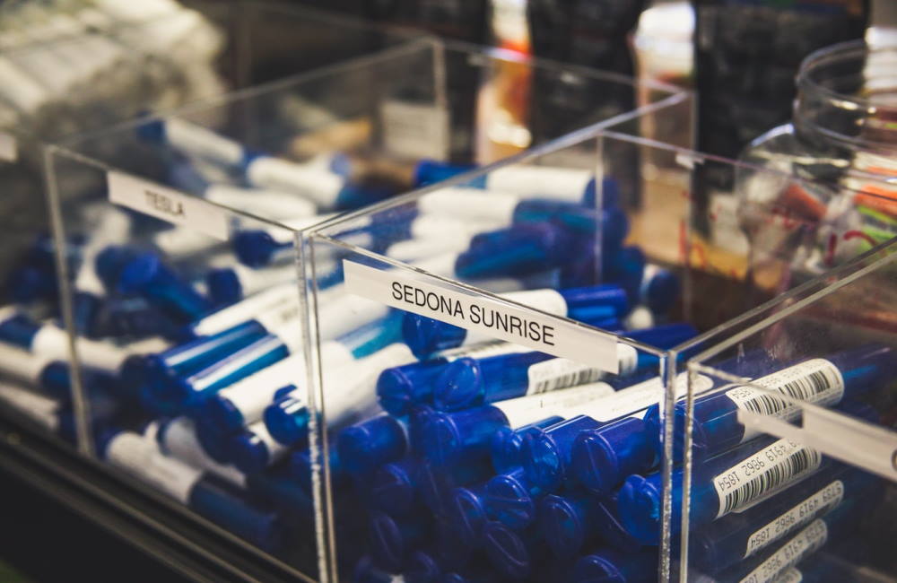
 Items that can be viewed from above will find a home in large display cases centered in the room where people can linger without bumping into others. This may be a good place for edibles. You can use a variety of retail displays inside the case to vary the height of objects, bring like items together or simply add visual interest to an otherwise bland surface. Use plenty of signage, too, to share origin stories, ingredients, expected effects, pricing, sizes/amounts available, etc. Small easels and sign holders that make it easy to update information and images may work well.
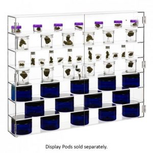
 Tall wall displays are great for giving people the opportunity to check out a product from various angles and put items meant to be viewed from the front, such as tincture bottles and body care containers, at eye level. From a layout perspective, you can give people options so that if one area they’re interested in already has a few shoppers hanging about, there’s another that’s just as enticing to explore. The ability to vary the height of the shelves in wall displays also make them a good choice for taller merchandise. As with the top-view display cases, adding helpful information next to products in or beside the wall display will be appreciated. Also consider acrylic display risers and cubes to help smaller or more unique items stand out, and cannabis display pods and spikes designed specifically to showcase buds.
Make subtle visual suggestions
As you wander your store, think about which like products to group together or showcase with other complementary products. This is part visual merchandising and part store layout magic, but it’s all in service of giving people the opportunity to come across new things they may be enticed to buy. You may choose to draw people past a display of products where they can compare/contrast them, then display a few of those same items in a different context further into the store.
 Observe, observe, observe
Take a few moments each day to watch what your customers do. Notice where they look when they come in, where they go first, where they congregate and at what point they’re likely to leave. See if they get bottled up anywhere or if the flow frustrates them at some point. Think about how they queue up to the budtender counter and whether there are any displays you can use to tempt them while they’re doing so. If you sell clothing, artwork, funky lighters, bumper stickers, or any number of non-cannabis-containing products, consider showcasing them in the line-up area and here and there throughout the store. When it comes to store layout, keep people moving in a sensible direction and give them the opportunity to explore, linger and make an unplanned impulse purchase or two.
 Ray Ko has been creating effective visual merchandising strategies for retailers for more than twenty years. Today, he is the senior ecommerce manager for shopPOPdisplays, a leading designer and manufacturer of stock and custom retail displays that helps brick-and-mortar and ecommerce stores of all sizes, across all industries, showcase their products to drive sales
This content was sponsored by shopPOPdisplays


